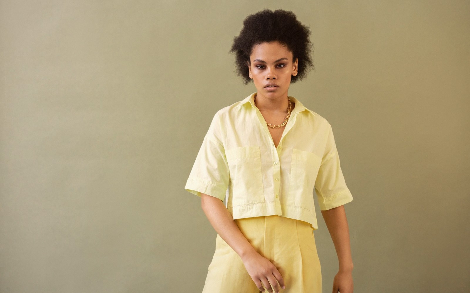
Why This Yellow, Why Now
Not every shade earns the word moment. Most colours drift onto the rails, occupy a rail-end or two, then retreat. Butter yellow did something different: it moved from luxury knitwear to high-street blazers to accessories to nails, and at each stop it gathered momentum rather than losing it. The reason isn't hard to trace. After a long run of greige, off-white and the general palette of a Scandinavian hotel lobby, dressing in colour again felt like a statement — but a true primary felt like too much of one. Butter yellow splits the difference. It reads as colour without reading as effort, which is, in the current mood, exactly the right balance.
The shade sits in that particular register between cream and sunshine: warm enough to feel deliberate, pale enough to feel effortless. It carries none of the aggression of a saturated lemon and none of the blandness of vanilla. Crucially, it flatters broadly. Where a strong canary yellow can wash out fairer complexions and flatten deeper ones, butter yellow tends to work across skin tones — the warmth of it reflects gently rather than fighting with what's underneath. That practical fact, more than any trend cycle logic, is probably why it spread so fast.
The Styling Logic
Head-to-toe butter yellow is the move for the committed — and it works, precisely because the shade is soft enough that tonal dressing doesn't overwhelm. A butter tailored trouser with a matching oversized shirt reads quietly powerful rather than costume-y, and the monochrome effect makes the whole thing feel considered without looking like you planned it all weekend. It's the colour equivalent of quiet luxury's instinct for restraint, but with something warmer and more generous in its finish.
For those not yet ready to commit to the full picture, the colour responds beautifully to contrast. Against a true white it looks clean and modern — try a butter linen trouser with a crisp white tank and you have something that works from a weekend market to a long lunch. Paired with chocolate or warm camel, it becomes almost autumnal despite its inherently spring-leaning character: the family resemblance between warm neutrals keeps everything cohesive. The pairing to avoid is anything with a blue-grey base — cool navy, slate, dusty lavender — which will fight the warmth of the yellow rather than sitting beside it.
The texture question matters too. Butter yellow in a stiff technical fabric can feel washed-out, even clinical. The shade wants materials that carry light gently: linen, cotton voile, brushed wool, soft suede. Silk and satin versions add a further dimension — the slight sheen makes the colour feel richer than it is, which is useful when the goal is impact without commitment to a bolder shade. In accessories, butter leather — whether in a wide-strap sandal, a soft hobo bag, or a belt — functions almost as a neutral, sitting alongside warmer tones in the way that camel always has.
The Accessory Angle
The most low-stakes entry point is always via accessories, and butter yellow earns its place there with minimal fuss. A butter leather tote or crossbody is versatile in a way that a statement red or cobalt rarely is — warm enough to read as intentional, neutral enough to work with most of what you already own. It lifts a white dress, breaks up an all-denim look, and adds dimension to any combination built on black.
Footwear is arguably where the colour does its most elegant work. A low butter-yellow mule or ballet flat brings a warm ground note to an outfit without demanding attention the way a coloured heel does. The shoe sits, does its work, and lets everything else read more put-together by association. This is the shoe equivalent of wearing a well-cut coat — the effort is invisible but the effect is real.
Jewellery in yellow gold has a natural conversation with the shade, but the more interesting move is mixing metals: a butter yellow outfit grounds silver hardware in a way that makes the cool tones feel deliberate rather than mismatched. The contrast is subtle enough to be sophisticated rather than jarring.
The Staying Power Question
Seasonal colours come and go, but butter yellow has something that most trend colours don't: it slots into real life. It doesn't demand a particular silhouette or occasion. It works in summer linen and in winter wool. It travels well in a suitcase and reads as well on a video call as it does in person. The shades that stick around tend to be the ones that feel worth the investment — that you can imagine reaching for in two years the way you reach for a good camel coat now. Butter yellow is making a solid case for exactly that kind of longevity. It came for spring. It might just stay.
Milan
In this piece
major Italian fashion capital; home of key luxury fashion weeks and ready-to-wear shows